
Monoliths
_12
A series of three works forming an homage to Kubrick's mathematically relevant Tycho monolith from the film 2001.
-

Monolith I (2011)
-

Monolith II (2012)
-
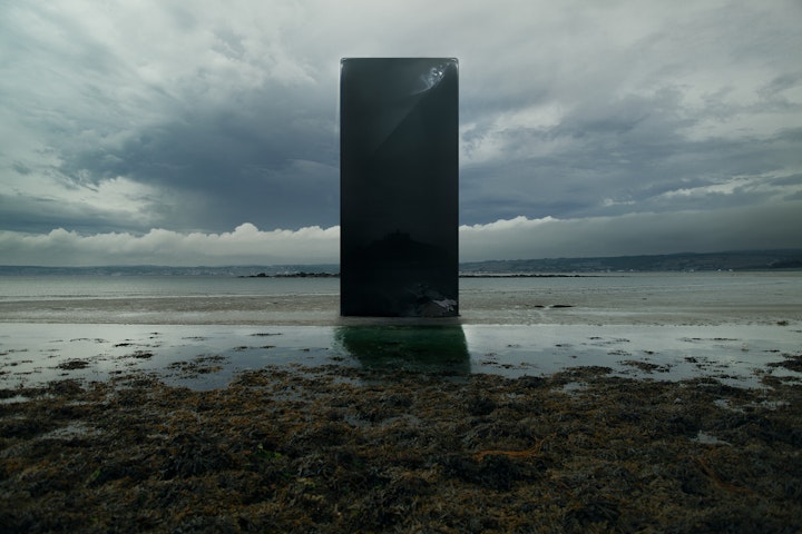
Monolith III (2012)
Monoliths
An homage to Kubrick's mathematically relevant Tycho Monolith from the film adaptation of Arthur C. Clark's 2001. The monolith is officially described as having a ratio of 1:4:9 with the depth being the smallest of those integers, and the length being the largest. This is an expression of (1×1):(2×2):(3×3).
Monolith I (2011). The piece illustrates the moment immediately following the tragic impact of a small body against this large, omnipresent object.
Monolith II (2012). From an original photo by James Cambourne taken at Saunton, between Exmoor and Dartmoor on the coast, presented in very wide 2.35:1 format.
Monolith III (2012). From an original photo taken at St. Michael’s Mount, Cornwall by Rob Chiu. I loved the mood and tone of the shot; cold and somewhat timeless. It already had a daunting but benevolent feel that made it the perfect backdrop to this piece.
__________________________
Buy Monolith art prints